sequoia financial
brand identity
about the project:
project type: student project
programs used: indesign, illustrator
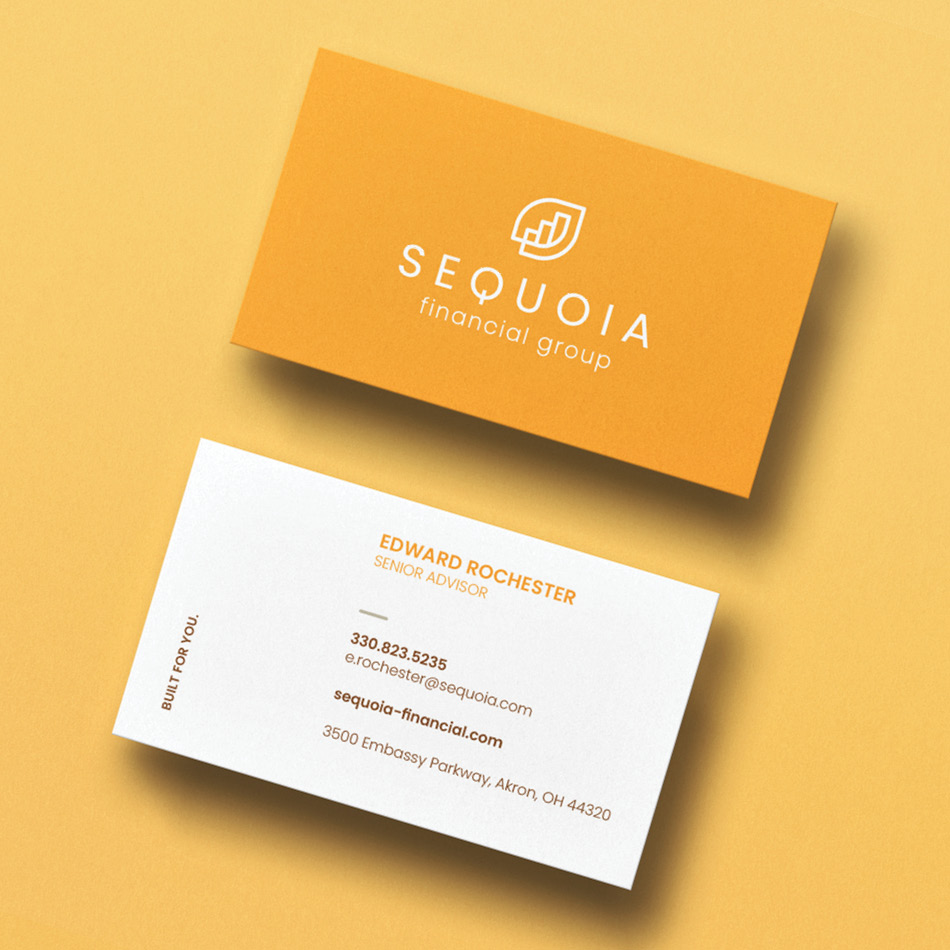
deliverables: brand identity, letterhead system
fun facts: the company had a rebrand during this project!
want to see my process? click here!
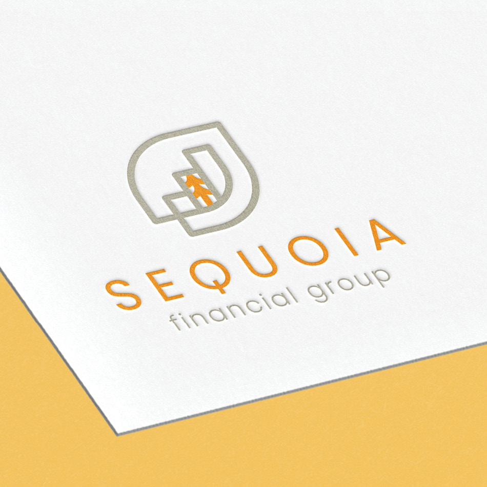
for the sequoia financial brand identity, my goal was to craft a mark that not only symbolizes financial growth and trust, but also harnesses the enduring strength and resilience associated with sequoia trees. i envisioned a design that seamlessly merges these concepts, creating a visual representation of stability and prosperity. the color palette was chosen to convey a sense of sophistication and professionalism, instilling confidence in the brand’s ability to deliver exceptional financial services. by thoughtfully balancing symbolism with simplicity, i aimed to create a brand that resonates with clients, and establishes sequoia as a trusted leader in the financial industry.


