groovy & gooey
packaging design
about the project:
project type: student project
programs used: indesign, illustrator
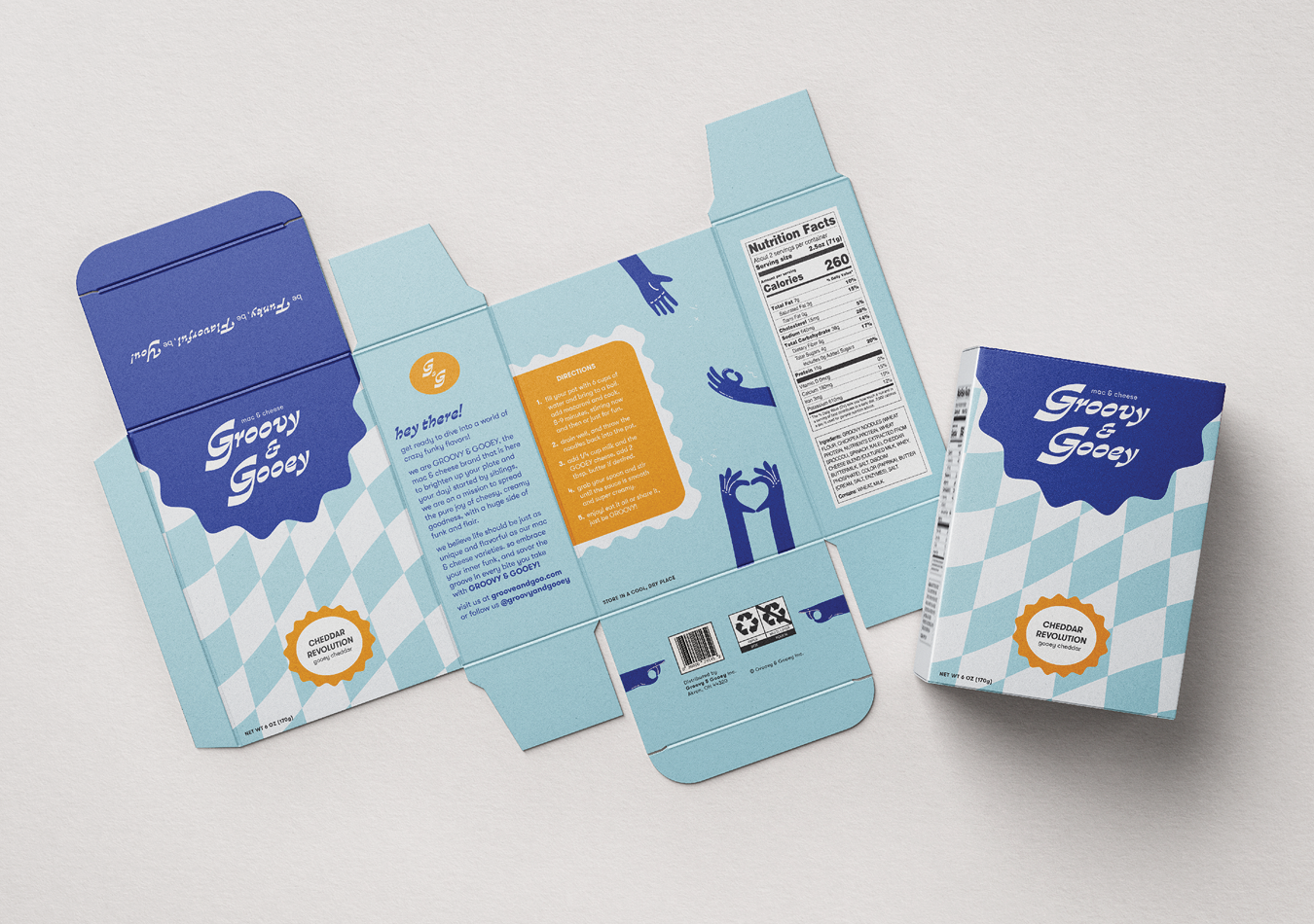
deliverables: brand promise, mac & cheese packaging
fun facts: one of the first times i used patterns!
want to see my process? click here!
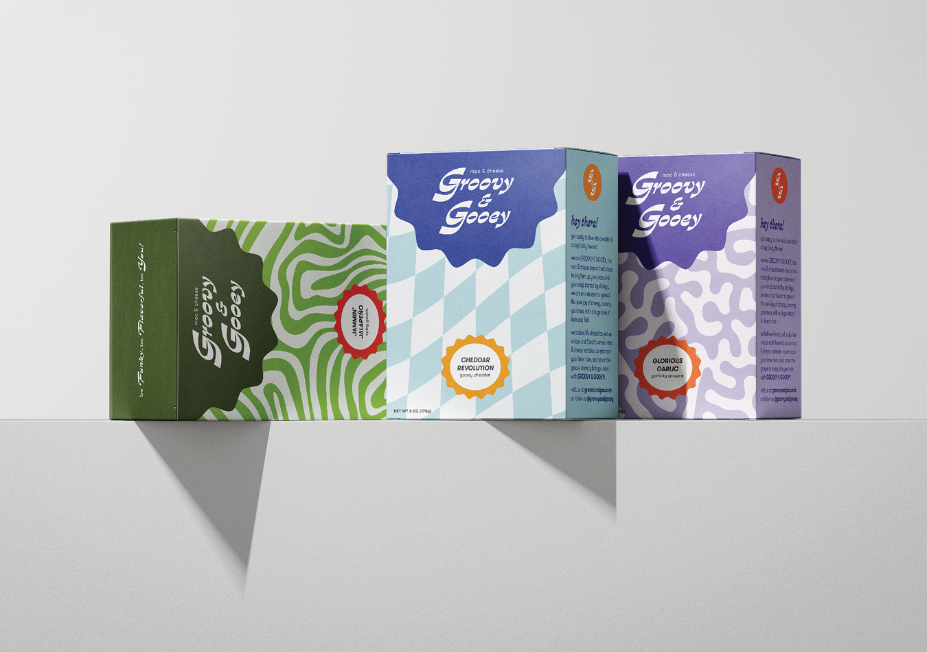
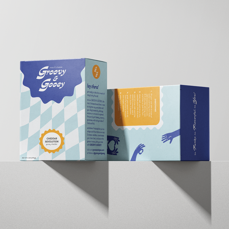
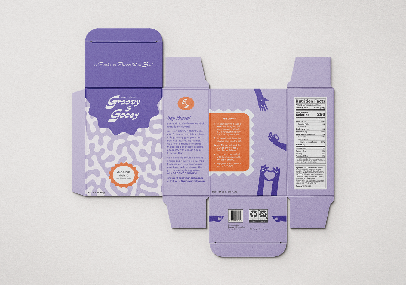
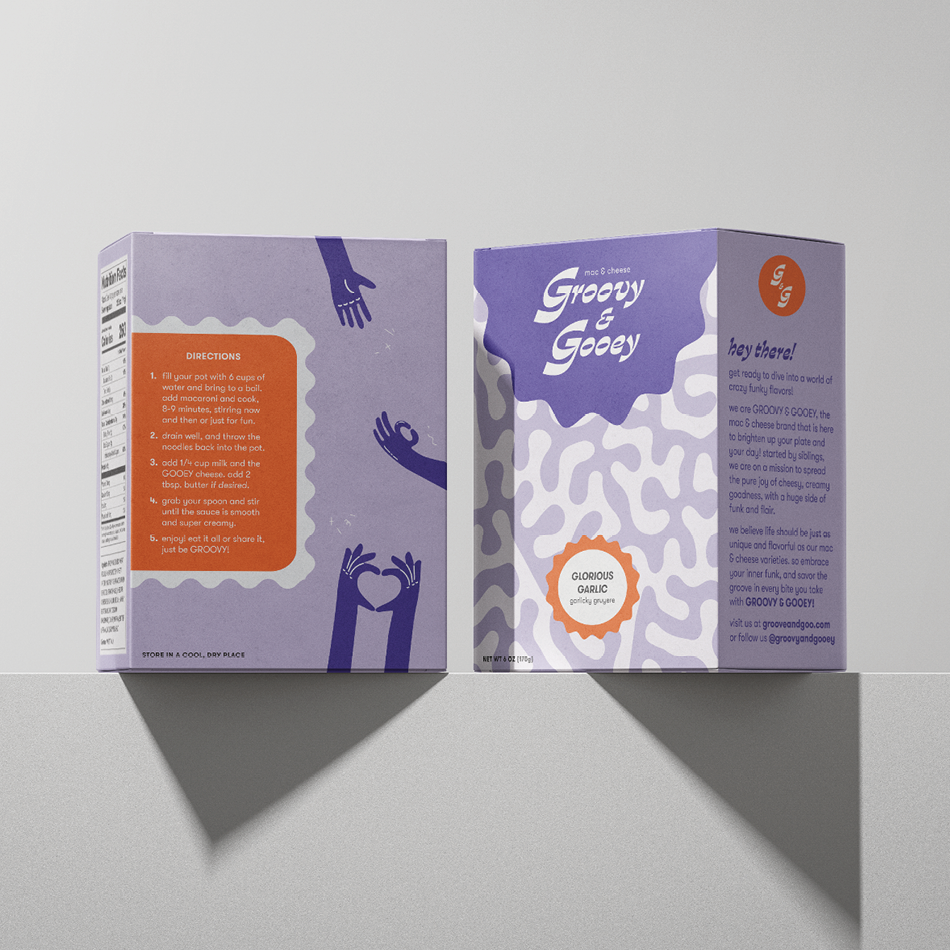
In approaching the project prompt of designing a mac and cheese box, my goal was to infuse the brand with a sense of fun, vibrancy, and funk. and so, Groovy & Gooey was created to be a playful and eccentric mac and cheese brand designed to brighten up both plates and moods. The brand persona, conveyed through lively copy and an upbeat tone, invites consumers to embrace the joy of cheesy goodness with a side of flair. while it is just mac and cheese, it was important for me to have the brand and packaging celebrate individuality and flavor diversity in every bite to really make it stand out on a shelf and in the mind of the consumer.
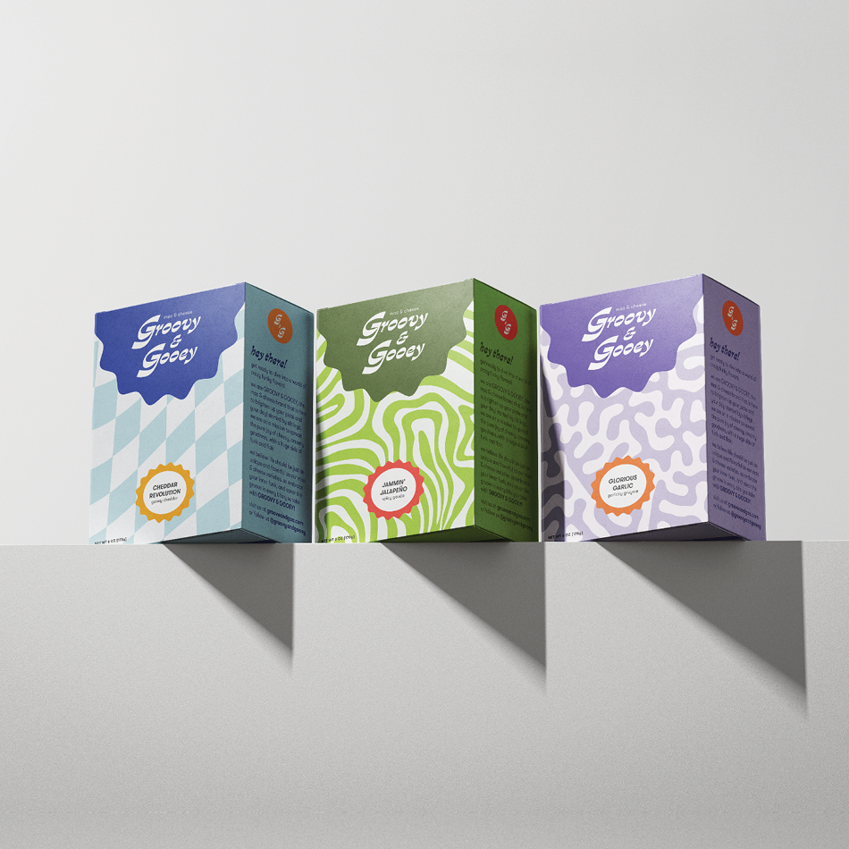
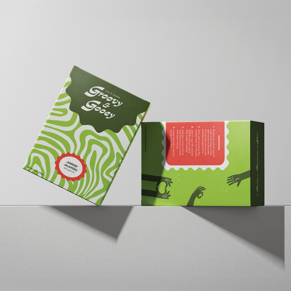
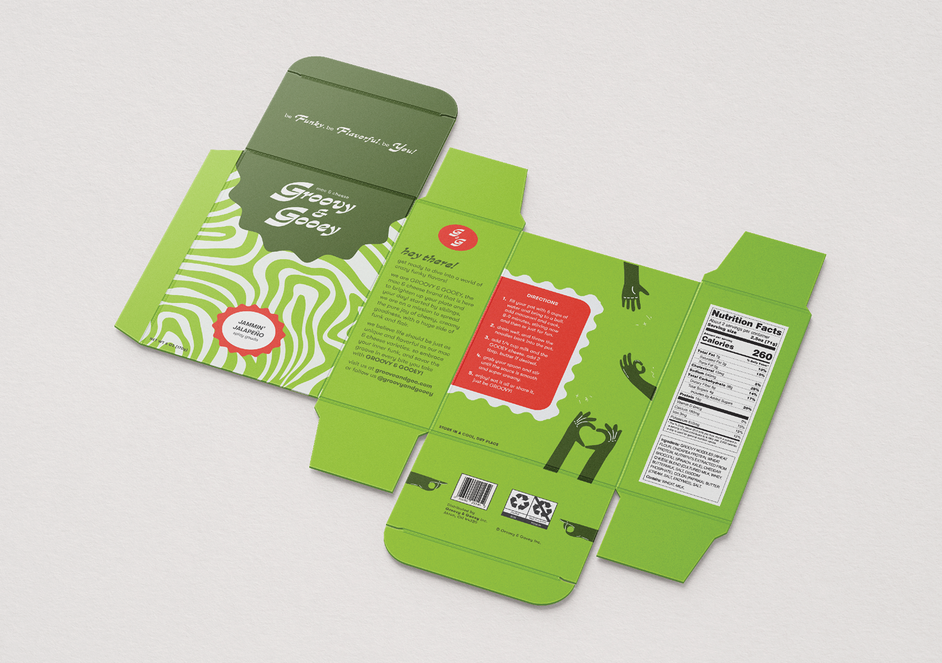
While I had experience creating patterns before, integrating them into this project presented unique challenges. However, through experimentation and problem-solving, I successfully incorporated dynamic patterns that complemented the brand’s funky aesthetic. Each box features a bold main color paired with a contrasting complementary color, enhancing visual appeal and reinforcing the lively persona of groovy & gooey.
The flavor variations, including Gooey Cheddar, Jammin’ Jalapeno, and Glorious Garlic, further amplify the funky eclectic charm, offering consumers a taste of adventure with every flavor profile. Groovy & Gooey become not just about mac and cheese, but about embracing your inner groove and adding a dash of excitement to mealtime.
