chill ice cream
brand identity
about the project:
project type: student project
programs used: indesign, illustrator, photoshop
deliverables: brand identity, build-out
fun facts: a student gold american advertising award winner!
want to see my process? click here!
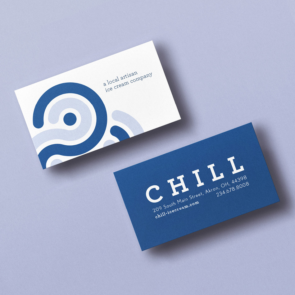
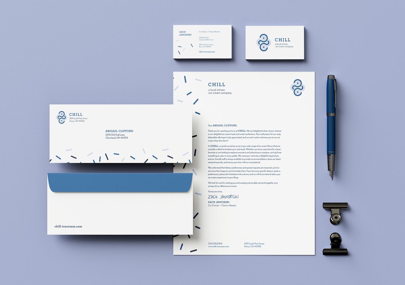
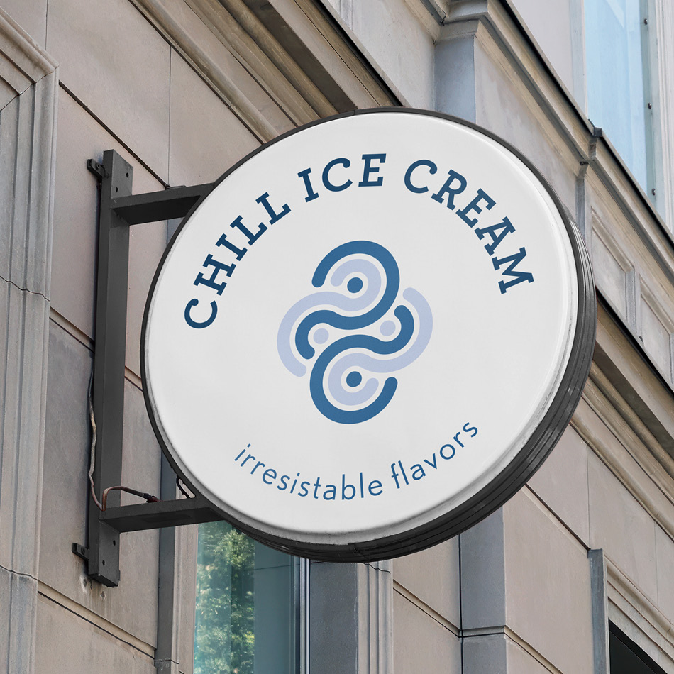
in designing the Chill Ice Cream brand identity, my intent was to capture the essence of their mission—to offer a tantalizing array of ever-changing, yet distinctive flavors that define their who they are. The logo mark serves as the visual embodiment of this mission, drawing inspiration from the fluidity of their unique and sometimes funky flavors. with a touch of whimsy, the design reflects the playful nature inherent in Chill’s ice creams, inviting everyone to expect something new and a delightful surprise with each visit.
Inspired by the beloved Honey Lavender flavor, the monochromatic color scheme pays homage to this local favorite, establishing a visual connection to Chill’s roots. These cool tones not only evoke the essence of the brand, but also serve as a visual cue for every frosty moment at Chill.
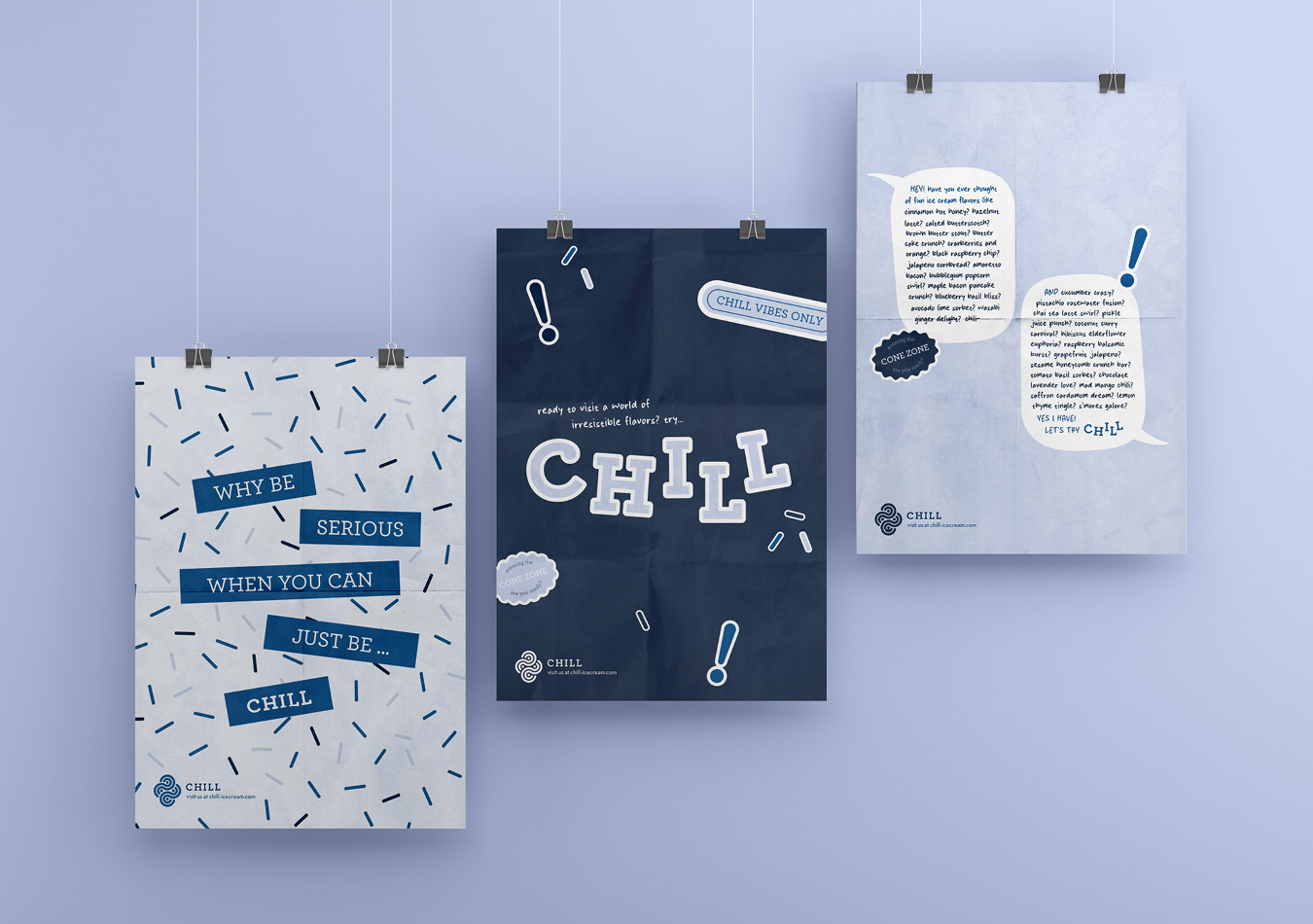
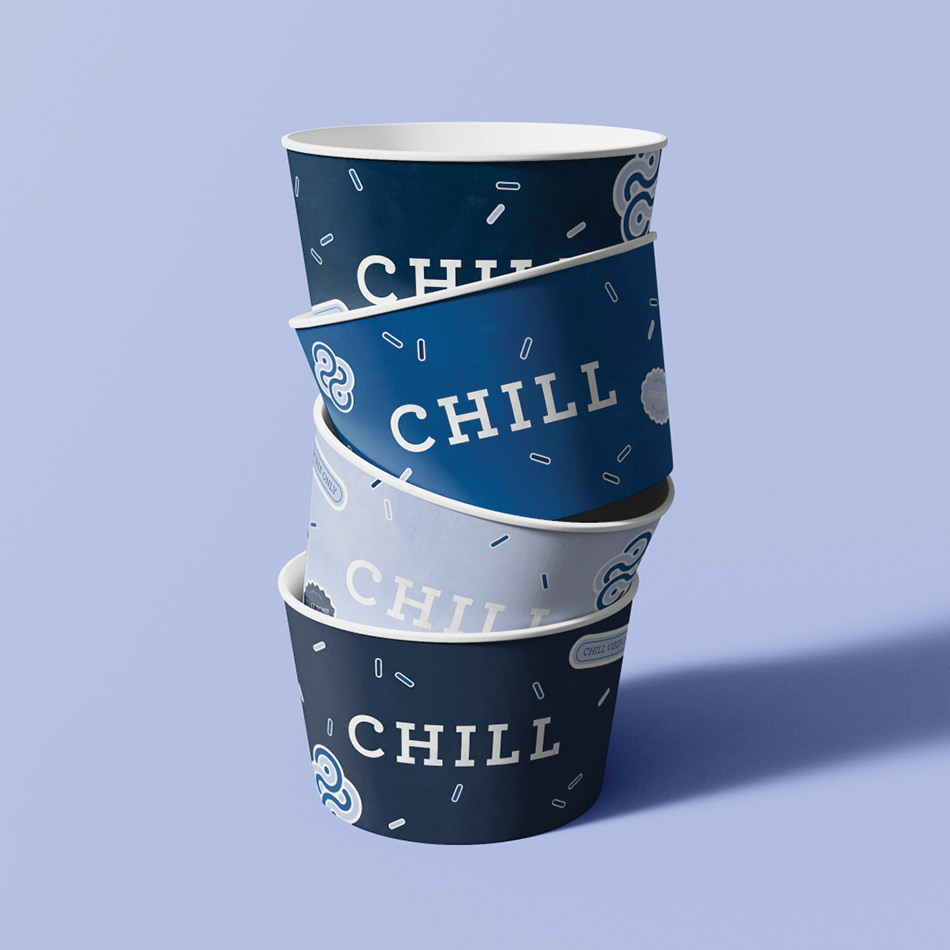
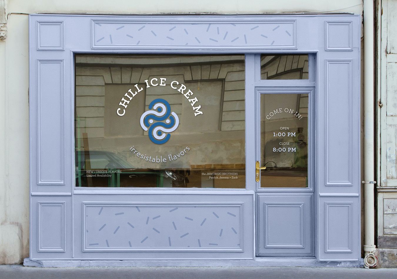
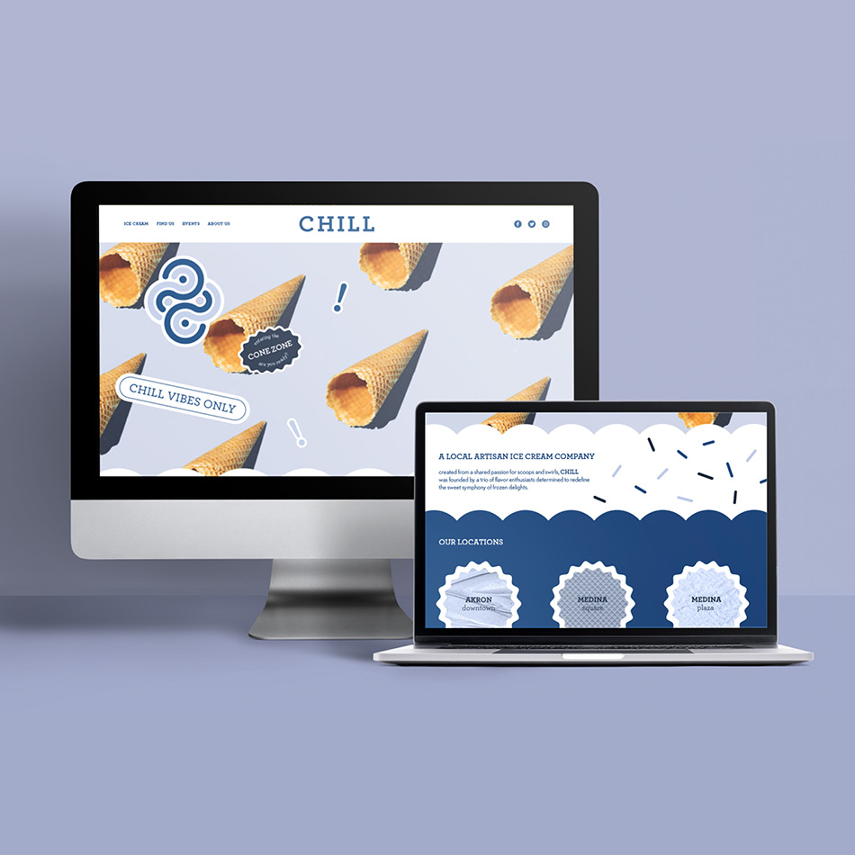
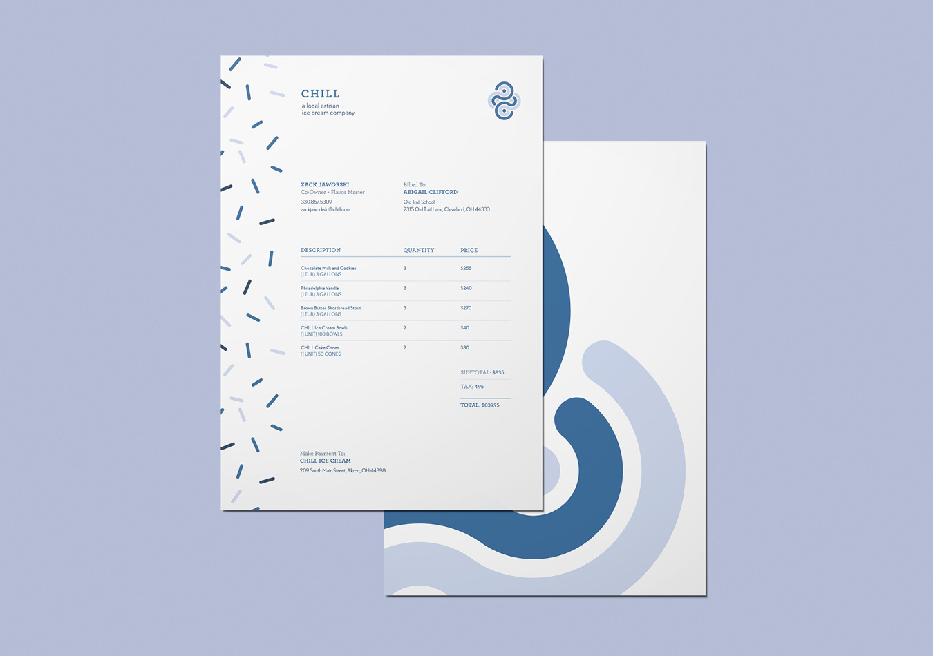
Beyond the logo, the design extends to a playful build-out, featuring a special handwritten typeface, unique graphic and sticker-like elements, and icy textures that amplify the vibrancy of the Chill brand identity. for me, the brand identity was more than just ice cream—it was about crafting an immersive and visually delightful narrative that mirrors the chill promise.
