bark well
packaging design
about the project:
project type: student project
programs used: indesign, illustrator
deliverables: packaging diverse forms
fun facts: a student silver american advertising award winner!
want to see my process? click here!
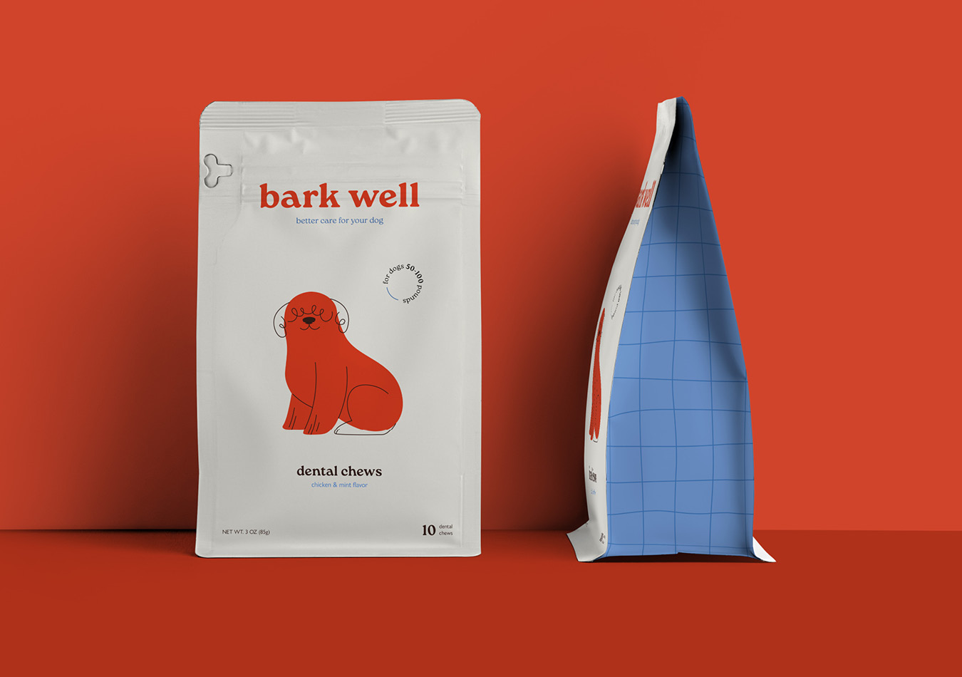
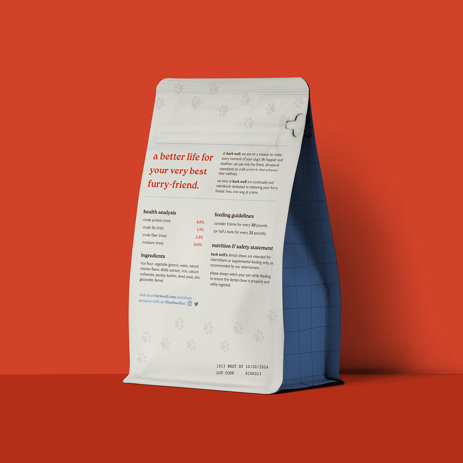
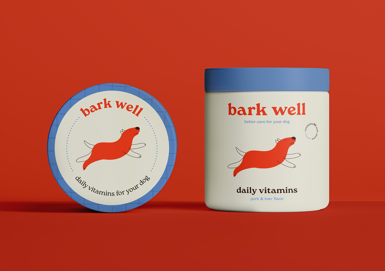
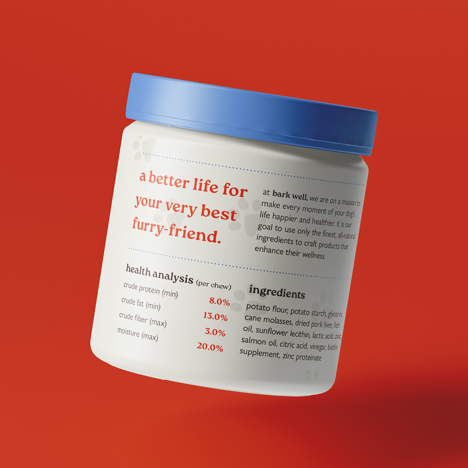
in conceptualizing Bark well, my intention was to design on packaging that had diverse forms and product categories. Drawing inspiration from my profound love for dogs, i designed a clean and sweet branding and packaging solution for a dog care brand that would resonate with fellow pet owners on a visual and emotional level. to me, the bark well mission was clear: to make every moment of your dog’s life happier and healthier.
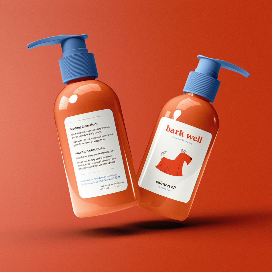
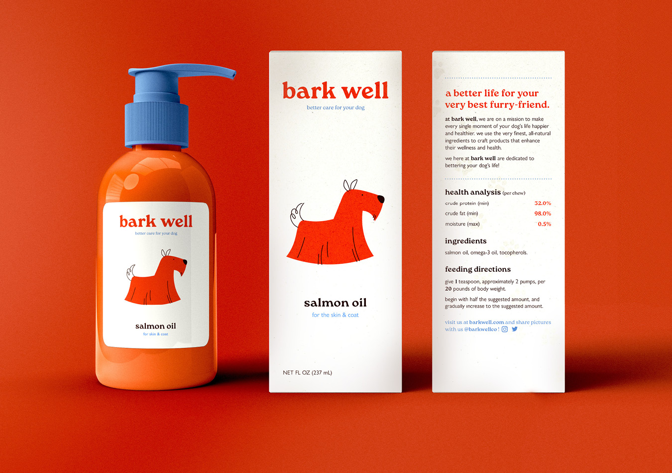
for the product line, which includes dental chews, salmon oil, and daily vitamins, I envisioned friendly packaging that not only communicates the essence of each product, but also catches the eye and stands out on the shelf. To achieve this, I crafted vector illustrations of dogs to be on the front of each product, serving as visual ambassadors that represent the product and the intended use, such as the long haired scottish terrier for salmon oil to help the skin and coat.
Every aspect of Bark well was meticulously crafted to be kind, clean, and paw-sitive! From the selection of materials to the typography choices and color palette, each decision was guided by the brand identity and the unique needs of our dogs. By infusing elements of playfulness and reliability into the design, I aimed to evoke a sense of trust and loyalty among consumers, fostering a lasting bond between Bark well and the furry clientele.
